


One of the best things about teaching at a retreat or on a stitching cruise is the time I get to just talk to stitchers in a casual setting. I have the opportunity to listen to their concerns and questions in what, I hope, they see as a safe place to do so.
Recently, a question came up several times in the same weekend and subsequent Facebook posts made me realize that the topic is relevant to a wide number of stitchers:
“Is it okay to change a design?”
I don’t remember the context of the question asked but I do remember my reaction. As usual, I answered with a story. A story about something that happened way back in the mid-80’s at the old Rockome Gardens event. A stitcher won a ribbon for her stitching of my Jannet Irving sampler. She had changed the predominantly red color scheme to blue and she was nervous that I would have a negative reaction. Far from it! I was, in equal measure, excited that she won a ribbon, pleased that she chose one of my designs to stitch, and proud that she put her own personal stamp on this project.

What if the reds were changed to blues?
To this day, I still feel that way.
What I didn’t know thirty years ago and only learned last month at the Work of the Hands retreat, is that some designers DO have a negative reaction when a stitcher modifies one of their designs. I have no way of knowing how widespread that attitude is. I do not know who the designers are (nor do I want to know). I don’t know what happened and to whom for these stories of malcontented designers to surface.
All I can do is to tell you how I feel about this topic.
First, given all the zillions of designs and classes out there, I am tickled pink when someone chooses one of my designs to stitch. Every stitcher has limited time to stitch and limited money to spend. If you choose to spend your time and money on one of my creative outbursts, I am very, very pleased!
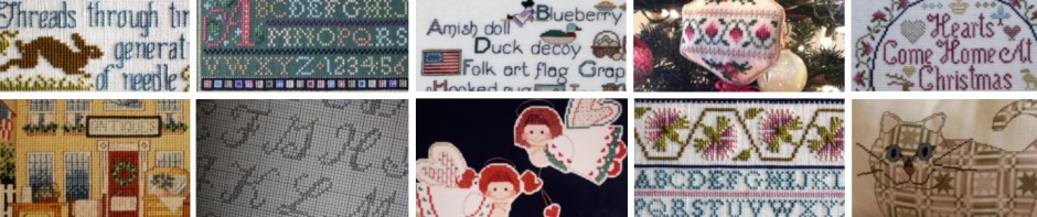
Second, once you make the choice, my design becomes your project. It becomes yours, not mine. Do what pleases you, not me. If you plan to use it to decorate your home, by all means change the colors to fit your decor. You want to substitute the verse for one you like better? Do it! To me, the chart is a blueprint, not a mandate. And when it comes to reproduction samplers, when you make a change you are continuing the tradition of the many women and young girls who came before us as each made subtle and not-s0-subtle changes in sampler patterns.
Third, if a professional designer is insulted that you have changed their design, the much-used phrase “it’s not you, it’s them” applies.
Fourth, and final, be proud of your project! I feel sad when any stitcher has negative feelings about their stitching projects. If you post a photo on social media like Facebook, it is a courtesy to all parties to mention the changes you made. It helps other stitchers by letting them know that if they purchase the same design, it won’t look exactly like yours. It’s nice to acknowledge the designer, too.
It is my hope that stitching will always bring joy to every stitcher for every project!
Stitch. Enjoy. Love.
Upcoming stitching events:
May 4 – 9, 2019: Stitchers’ Escapes Cruise to Bermuda with me and Diane Herrman
July 11-14, 2019: Work of the Hands in Winston-Salem, NC with me and Terri Bay
September 6 – 13, 2019: Stitchers’ Escapes Cruise to Alaska with me and Toni Gerdes
Get cruise details at www.StitchersEscapes.com
For WOTH details, send me an email: jeanfarish@gmail.com

